If you like this post, check out the 2010 version!
Preliminary official GDP statistics for 2008 are out. It's time for an updated version of my Real GDP Is Shrinking post, which is currently #6 on my "Best of FSK" list. The 2007 version is #18 on my "Best of FSK" list. I'm planning to make this a regular annual feature.
Contrary to official government statistics, the US economy is shrinking at an alarming rate.
In the following graph, I set GDP in 2000 equal to 100. Instead of using the CPI as my deflator, I used M2 and the price of gold. The results were surprising!

According to the above chart, the US economy is pretty severely ****ed.
In the rest of this article, I give the details of the above calculation.
The official inflation-adjusted GDP numbers are calculated using the CPI. The CPI is biased and understates the true inflation rate. If you adjust GDP using an unbiased inflation measure, the US economy is shrinking rapidly.
A common myth is "The US economy is dependent on continuous growth to survive!" This is false. Due to the Compound Interest Paradox, the US economy is dependent on continuous money supply growth. Due to biased inflation measures, money supply growth is misreported as economic growth.
Source Data
Here is the raw data that I use as a source for my calculations.
Raw GDP
I use this page as my source for GDP data.
This isn't the "official" final number, but it's good enough. If there are revisions, it won't substantially affect my conclusions.
I use GDP not adjusted for inflation. Later, I'm going to adjust for inflation correctly, instead of using the CPI.
The GDP value is in billions of dollars. The population is in thousands. "Per cap GDP" is GDP divided by Population.
| Year | GDP ($B) | Pop (k) | Per Cap GDP |
| 1990 | 5803.10 | 250181 | 23195.61 |
| 1991 | 5995.90 | 253530 | 23649.67 |
| 1992 | 6337.70 | 256922 | 24667.80 |
| 1993 | 6657.40 | 260282 | 25577.64 |
| 1994 | 7072.20 | 263455 | 26844.05 |
| 1995 | 7397.70 | 266588 | 27749.56 |
| 1996 | 7816.90 | 269714 | 28982.18 |
| 1997 | 8304.30 | 272958 | 30423.36 |
| 1998 | 8747.00 | 276154 | 31674.36 |
| 1999 | 9268.40 | 279328 | 33181.06 |
| 2000 | 9817.00 | 282413 | 34761.15 |
| 2001 | 10128.00 | 285294 | 35500.22 |
| 2002 | 10469.60 | 288055 | 36345.84 |
| 2003 | 10960.80 | 290729 | 37701.09 |
| 2004 | 11685.90 | 293348 | 39836.30 |
| 2005 | 12421.90 | 296000 | 41965.88 |
| 2006 | 13178.40 | 298820 | 44101.47 |
| 2007 | 13807.50 | 301737 | 45760.05 |
| 2008 | 14264.60 | 304530 | 46841.36 |
M2
Instead of using the CPI as my index of inflation, I use M2. The Federal Reserve publishes M2 statistics.
| Year | Raw M2 ($B) | % chg |
| 1990-Jan. | 3176.6 | |
| 1991-Jan. | 3296 | 3.76% |
| 1992-Jan. | 3389.7 | 2.84% |
| 1993-Jan. | 3431.5 | 1.23% |
| 1994-Jan. | 3489.6 | 1.69% |
| 1995-Jan. | 3508.7 | 0.55% |
| 1996-Jan. | 3665 | 4.45% |
| 1997-Jan. | 3842.5 | 4.84% |
| 1998-Jan. | 4068.2 | 5.87% |
| 1999-Jan. | 4416.9 | 8.57% |
| 2000-Jan. | 4680.5 | 5.97% |
| 2001-Jan. | 4981.6 | 6.43% |
| 2002-Jan. | 5458.5 | 9.57% |
| 2003-Jan. | 5798.2 | 6.22% |
| 2004-Jan. | 6058.6 | 4.49% |
| 2005-Jan. | 6408.4 | 5.77% |
| 2006-Jan. | 6705.8 | 4.64% |
| 2007-Jan. | 7056.3 | 5.23% |
| 2008-Jan. | 7484.4 | 6.07% |
| 2009-Jan. | 8224.4 | 9.89% |
Notice the sharp increase in M2 in 2008. Also notice that, in almost every year, the rate of increase in M2 is greater than the CPI.
M2 is the broadest money supply measure still published by the Federal Reserve. Compared to M3, M2 excludes accounts over $100,000 and dollars held outside the USA.
M3
The Federal Reserve ceased publishing M3 in 2006, so I can't use M3. Superficially, the Federal Reserve says it stopped publishing M3 because the data was too hard to collect. That reason is invalid. Instead of publishing M3 weekly, the Federal Reserve could have published M3 quarterly or annually.
The Federal Reserve stopped publishing M3 because they wanted to cover up how bad inflation really is.
When the Federal Reserve stopped publishing M3, it was growing at a rate of 15%/year. Some people have reconstructed M3 from other available statistics. (Wow! Look at the "Fed & Treasury total money supply" chart from that page!)
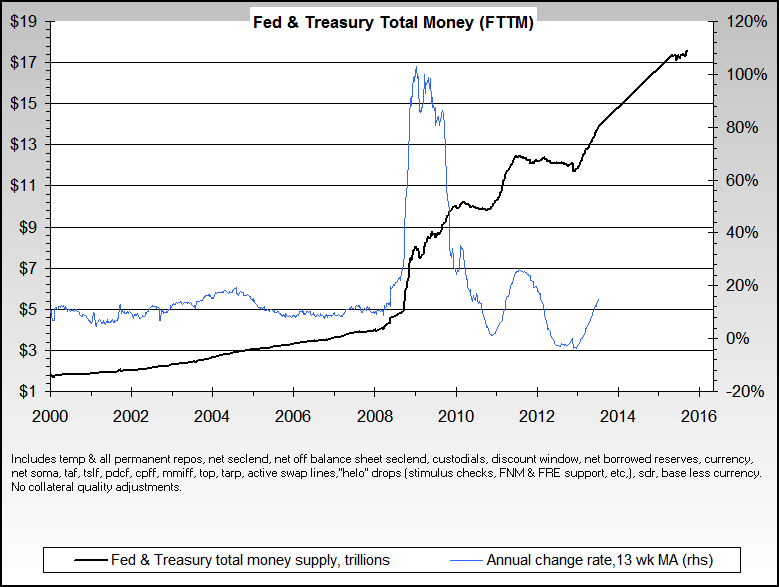
Look at the spike in the past few months!
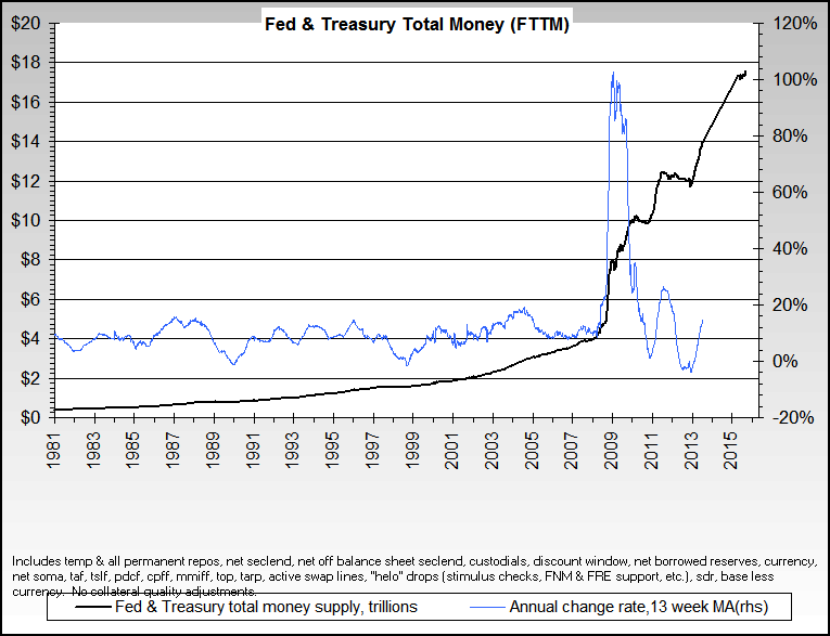
On the second chart, it's even worse!
(There is a slight error on those two charts. The Y-Axis for total money should be a log-scale. That makes the recent increase seem larger than it actually is.)
All that stimulus/bailout money is a huge spike in "total money supply".
Even though M3 is no longer available, there's another unbiased measure of inflation.
Gold
The increase in the price of gold should track the growth of M3.
If you believe "Gold is money!", then it follows "The FRN-denominated price of gold is a fair and unbiased measure of inflation." There are short-term fluctuations, but the over a 5-10+ year period, gold should track true inflation pretty closely. In 2008, the price of gold increased less than M2, but over the past 5-10 years, the price of gold has risen substantially faster than M2.
Unlike Federal Reserve Points, gold is real money. The purchasing power of an ounce of gold has remained mostly constant for 100+ years. Some people say the purchasing power of gold has been constant for thousands of years. I don't know any reliable source for the price of a loaf of bread 1000 years ago.
For example, the price of a Model T car, quoted in gold, is approximately the same as the price of a car in the present. A modern car has more features than a Model T, but the total price is the same. When comparing goods available now to goods available 100 years ago, the price quoted in gold is usually similar. Of course, no amount of gold would have bought you a computer or cellular phone 100 years ago.
Over a period of several years, the gold price is the least biased measure of inflation.
I used these two sources for the price of gold.
The price is the price on January 1 of that year.
| January Yr | Price | % chg |
| 1990 | $386.20 | |
| 1991 | $353.15 | -8.56% |
| 1992 | $333.00 | -5.71% |
| 1993 | $391.75 | 17.64% |
| 1994 | $383.25 | -2.17% |
| 1995 | $387.00 | 0.98% |
| 1996 | $369.00 | -4.65% |
| 1997 | $287.05 | -22.21% |
| 1998 | $288.70 | 0.57% |
| 1999 | $290.25 | 0.54% |
| 2000 | $279.11 | -3.84% |
| 2001 | $271.04 | -2.89% |
| 2002 | $309.73 | 14.27% |
| 2003 | $363.38 | 17.32% |
| 2004 | $409.72 | 12.75% |
| 2005 | $444.74 | 8.55% |
| 2006 | $530.00 | 19.17% |
| 2007 | $639.75 | 20.71% |
| 2008 | $846.75 | 32.36% |
| 2009 | $874.50 | 3.28% |
Gold's price has risen substantially so far in 2009. Gold is currently over $920/ounce. (I put this post in my draft queue a few days before finishing it. The price of gold is jumping around a lot!)
In 2008, M2 increased by more than the price of gold. There's still plenty of room for the FRN-denominated price of gold to increase. There continues to be massive inflation to bail out the financial industry and other insiders. Eventually, this will show up as an increase in the price of gold.
There has been extensive manipulation of the gold price. Central banks have nearly exhausted their gold reserves. They are losing their ability to suppress the gold price.
The bad guys really want gold to be discredited as an investment. Physical gold probably is a better investment than stocks! Even though corporations receive massive government subsidies, there also is a massive amount of fraud and waste. Corporate management is more concerned with lining their pockets than creating value for shareholders. It is possible that gold are silver are the only investments that yield a 0% inflation-adjusted return (minus transaction costs)!
Some people are saying "gold is experiencing an asset bubble". The price of gold/$ is skyrocketing. Compared to other commodities, the price of gold is relatively constant. The price of gold/silver or gold/oil is mostly unchanged. It is inaccurate to say "the price of gold is skyrocketing". It is more accurate to say "the value of the dollar is crashing".
The increase in the price of gold tracks "reconstructed M3" fairly closely. I don't see a bubble forming in gold.
If you believe "gold is money", then the price of gold is the least biased measure of inflation. For me, this is a definition.
Calculations
Here, I share the result of my calculations.
Per Capita M2
Using M2 as my measure of inflation is somewhat inaccurate. If the population increases by 1%, then 1% more money can be printed without causing inflation. Of course, the financial industry still prints this new money and recognizes seignorage profit. If the population grows and the money supply remains constant, then people would naturally experience deflation. This would be an extra incentive to savers. Instead, this benefit is stolen by the financial industry.
Per capita M2 is a more honest measure of price inflation than M2.
| Year | Per Cap M2 |
| 1990-Jan. | 12697 |
| 1991-Jan. | 13000 |
| 1992-Jan. | 13193 |
| 1993-Jan. | 13184 |
| 1994-Jan. | 13246 |
| 1995-Jan. | 13162 |
| 1996-Jan. | 13588 |
| 1997-Jan. | 14077 |
| 1998-Jan. | 14732 |
| 1999-Jan. | 15813 |
| 2000-Jan. | 16573 |
| 2001-Jan. | 17461 |
| 2002-Jan. | 18950 |
| 2003-Jan. | 19944 |
| 2004-Jan. | 20653 |
| 2005-Jan. | 21650 |
| 2006-Jan. | 22441 |
| 2007-Jan. | 23386 |
| 2008-Jan. | 24577 |
| 2009-Jan. | 26739 |
(I used 1% more than 2008 for the 2009 population figures, since those weren't released yet.)
Inflation Adjusted GDP
Now, I calculate inflation adjusted GDP. I adjust for inflation correctly, instead of using the CPI. First, I'm going to use M2 as my inflation index. Then, I'm going to use gold as my inflation index.
For those of you keeping score from last year, I had an "off by one" error last year. I was using M2 from January 2006 to January 2007 to estimate inflation in 2007. I should have used M2 from January 2007 to January 2008. I fixed that error this year.
Per capita GDP and per capita M2 are copied from my previous tables. "GDP/M2" is my index for how much the US economy is growing or shrinking. "% gain" is the % gain relative to the previous year. "Cum % gain" is the cumulative percentage gain from that year to 2008. For example, in the row for the year 2000, the "Cum % gain" is -12.50%. This means that the US economy shrunk by 12.50% from January 1, 2000 to January 1, 2009. "Ann %" is the "Cum % gain" converted to an annualized percentage.
| Year | Per Cap GDP | Per Cap M2 | GDP/M2 | % Gain | Cum % Gain | Ann # Gain |
| 2009 | 26739 | |||||
| 2008 | 46841 | 24577 | 1.7518 | -5.92% | -5.92% | -5.92% |
| 2007 | 45760 | 23386 | 1.8619 | -1.27% | -7.11% | -3.62% |
| 2006 | 44101 | 22441 | 1.8858 | 0.84% | -6.33% | -2.15% |
| 2005 | 41966 | 21650 | 1.8701 | 1.63% | -4.80% | -1.22% |
| 2004 | 39836 | 20653 | 1.8400 | 0.80% | -4.04% | -0.82% |
| 2003 | 37701 | 19944 | 1.8254 | 0.16% | -3.88% | -0.66% |
| 2002 | 36346 | 18950 | 1.8224 | -2.72% | -6.49% | -0.95% |
| 2001 | 35500 | 17461 | 1.8734 | -5.89% | -12.00% | -1.59% |
| 2000 | 34761 | 16573 | 1.9908 | -0.57% | -12.50% | -1.47% |
| 1999 | 33181 | 15813 | 2.0021 | -0.05% | -12.55% | -1.33% |
| 1998 | 31674 | 14732 | 2.0031 | -3.01% | -15.18% | -1.49% |
| 1997 | 30423 | 14077 | 2.0652 | 0.31% | -14.91% | -1.34% |
| 1996 | 28982 | 13588 | 2.0588 | 0.82% | -14.22% | -1.17% |
| 1995 | 27750 | 13162 | 2.0421 | 0.13% | -14.11% | -1.08% |
| 1994 | 26844 | 13246 | 2.0396 | 5.62% | -9.28% | -0.65% |
| 1993 | 25578 | 13184 | 1.9310 | 3.21% | -6.38% | -0.41% |
| 1992 | 24668 | 13193 | 1.8711 | 4.38% | -2.27% | -0.14% |
| 1991 | 23650 | 13000 | 1.7925 | 0.47% | -1.82% | -0.10% |
| 1990 | 23196 | 12697 | 1.7842 |
The data in this table is really disturbing. From 1998-2007, the US economy was shrinking at an annualized rate of 1.49%. From 1990 to 2007, the US economy overall shrank per person, at a rate of 0.1% per year.
If you use M3 instead of M2, the results are really depressing. The Federal Reserve hasn't published M3 for several years, so I can't repeat the calculation with M3.
The price of gold is a reasonable substitute for M3. When you use gold as the inflation index, the results are *REALLY* depressing.
This table has the same format as the previous table. "GDP/Gold" is the per-capita GDP in ounces of gold. "% gain" is the 1 year gain in the size of the economy. "Cum % gain" is the cumulative gain/loss for the time period. "Ann %" is "Cum % gain" converted to an annualized value.
| Year | Per Cap GDP | Price | GDP/Gold | % Gain | Cum % Gain | Ann # Gain |
| 2009 | $874.50 | |||||
| 2008 | 46841.36 | $846.75 | 53.5636 | -0.89% | -0.89% | -0.89% |
| 2007 | 45760.05 | $639.75 | 54.0420 | -21.60% | -22.30% | -11.85% |
| 2006 | 44101.47 | $530.00 | 68.9355 | -12.94% | -32.35% | -12.22% |
| 2005 | 41965.88 | $444.74 | 79.1809 | -11.60% | -40.20% | -12.06% |
| 2004 | 39836.30 | $409.72 | 89.5721 | -2.66% | -41.79% | -10.26% |
| 2003 | 37701.09 | $363.38 | 92.0167 | -8.00% | -46.45% | -9.89% |
| 2002 | 36345.84 | $309.73 | 100.0216 | -12.73% | -53.27% | -10.30% |
| 2001 | 35500.22 | $271.04 | 114.6167 | -10.63% | -58.24% | -10.34% |
| 2000 | 34761.15 | $279.11 | 128.2510 | 7.88% | -54.94% | -8.48% |
| 1999 | 33181.06 | $290.25 | 118.8817 | 8.94% | -50.92% | -6.87% |
| 1998 | 31674.36 | $288.70 | 109.1278 | 3.56% | -49.17% | -5.97% |
| 1997 | 30423.36 | $287.05 | 105.3805 | 4.37% | -46.95% | -5.15% |
| 1996 | 28982.18 | $369.00 | 100.9656 | 34.26% | -28.77% | -2.58% |
| 1995 | 27749.56 | $387.00 | 75.2021 | 8.42% | -22.78% | -1.83% |
| 1994 | 26844.05 | $383.25 | 69.3645 | 3.93% | -19.74% | -1.46% |
| 1993 | 25577.64 | $391.75 | 66.7388 | 5.99% | -14.94% | -1.01% |
| 1992 | 24667.80 | $333.00 | 62.9682 | -11.34% | -24.58% | -1.65% |
| 1991 | 23649.67 | $353.15 | 71.0200 | 8.13% | -18.45% | -1.13% |
| 1990 | 23195.61 | $386.20 | 65.6820 |
There has been substantial manipulation of the gold price. Even so, the conclusions are surprising.
If you use gold as the index of inflation, the US economy has been in severe recession/depression every year since 2001. The US economy has shrunk a total of 58% in that time! The US economy is shrinking at an annualized rate of more than 9% per year! The rate of shrinkage of the US economy is increasing!
2008 was a relatively good year for per capita GDP denominated in gold, with a decrease of "only" 0.89%. Gold has risen substantially so far in 2009, and that trend should continue all year.
If you go back to the 1990s, the results aren't as bad. In the 1990s, the world's central banks were selling off their gold supplies to manipulate the price of gold downward. Recently, they have nearly exhausted their gold reserves. They are no longer able to manipulate the gold price as much. Even with that manipulation, the gold-denominated GDP has been decreasing by more than 1% per year since 1990.
There are price variations in any given year. My analysis covers several years. Over that time, any short-term fluctuations should be smoothed out.
Summary
Contrary to official government reports, the US economy is in really bad shape. All my data comes from official sources. With a little independent thinking, you can manipulate government data to tell the true story.
Government policymakers/terrorists use the CPI as their measure of inflation. The CPI is biased and severely understates inflation. Relying on this corrupt statistic, they see an unfairly optimistic picture of the US economy. If you use the CPI as your index of inflation, then money supply inflation is misreported as economic growth.
I only performed this calculation for the US economy. Many of my readers are located outside the USA. I suspect a similar calculation in other countries would show a similar result. The economy in Canada, the UK, the EU, and Australia is probably just as bad.
If you use M2 as your index of inflation, the US economy has been shrinking at a rate of 1.5% per year since 1998. If you use the price of gold as your index of inflation, the US economy is in a severe depression. If you use gold as the index of inflation, then the US economy has shrunk by 58% since 2001!
I'll repeat the graph I displayed at the top of the article, which illustrates my conclusion "The US economy is ****ed!"
Criticism of Using GDP
One valid criticism of this post is "GDP is a meaningless statistic." However, GDP is the best broad measure of the US economy that's widely discussed. There's also GNP, which is highly correlated with GDP.
Parasitic economic activity is included as part of the GDP. The salaries of lawyers, bankers, accountants, etc. is 100% directly backed by State violence, yet their work has no economic value. It is inaccurate to include this as part of GDP. Psychiatrists perform negative work, murdering millions of people, but their labor counts towards GDP. State violence causes doctors to earn above-market salaries. It is wrong to include all of their salary in GDP. If the "rate of parasitism" is constant over time, then using GDP would still be reasonable. The "rate of parasitism" appears to be increasing rather than decreasing.
There's no easy way to measure "GDP minus parasitic activity", so I just use GDP.
The GDP doesn't accurately measure true economic activity that occurs in the USA. Suppose a lead-painted toy is imported from China for sale in the USA. If the toy has a value of $3 when it comes off the boat, and a retail value of $20, then this counts as $17 towards US GDP. All the US corporation did was import, market, transport, and sell the product. The US corporation didn't really add any tangible value, but most of the value of the sale counts towards GDP. Such a practice is only sustainable because China and other countries are willing to trade tangible goods for a piece of paper.
The size of real GDP pretty tightly correlates with the evil power of the State. The "grey market" and "black market" economy is not included in official GDP. That is fine with me, because that wealth isn't being used against me!
People find this post interesting because my information comes 100% from mainstream sources. By doing a correct analysis with the numbers, I get a true picture of economic growth in the USA. The CPI is a biased measure of inflation. This causes money supply inflation to be misreported as economic growth. If I use M2 or the price of gold as the index of inflation, this paints a dramatically different picture of the US economy than what mainstream sources indicate.
Mike Gogulski complained that I didn't include the chart for 1990-2008. I only gave a chart for 2000-2008, because the conclusions were more dramatic. Here is the chart for 1990-2008.

If you liked this post, check out the 2010 version!
5 comments:
I think you have a better view of our economic condition than I could ever have. I am wondering if you could make a brief chart predicting the collapse. Almost like they do in Vegas. For instance..
2009 unlikely .5% chance
2010 unlikely 1% chance
2011 maybe 4% chance
2012 likely 29% chance
If you could put your condensed ideas in next weeks reader mail I would be most great full. Also if you want to throw in some handy caps or other ifs and or(s) that could make it fun. Thank you for your time.
Fritz
I really hope that is easier then it looks because you just made me feel mathematicly inferior X100 lol.
Really though great work. I agree with Fritz what would be your estimations?
Ye gods! That first graph is dramatic.
Still, I'm gonna bitch: You've framed an 18-year period in the post title, but the first graph and several other tables/graphs on reference the past 8 years. Why?
While I'm sure I'd completely disagree with you 99% of the time, you've put an -er- dangerously obsessive amount of effort into this and I appreciate it.
Via a different angle, it basically backs up what I've been saying for well over a decade, that the American economy is (as you unfortunately understate it through self censorship) completely " ****ed ".
However, I'm willing to bet the numbers will make an even stronger case if you take them back just another 10 or 20 years.
This train wreck has been decades in the making and there are millions of fingerprints on it. It may take the entire century to fix.
Your comments on the Austian school are somewhat misleading. From an economic point of view the Austrians don't care what form Govt' takes as long as human action is allowed to freely function in a free market. In practice that really means Anarchy. Rothbard was a big fan of Anarchy.
Post a Comment